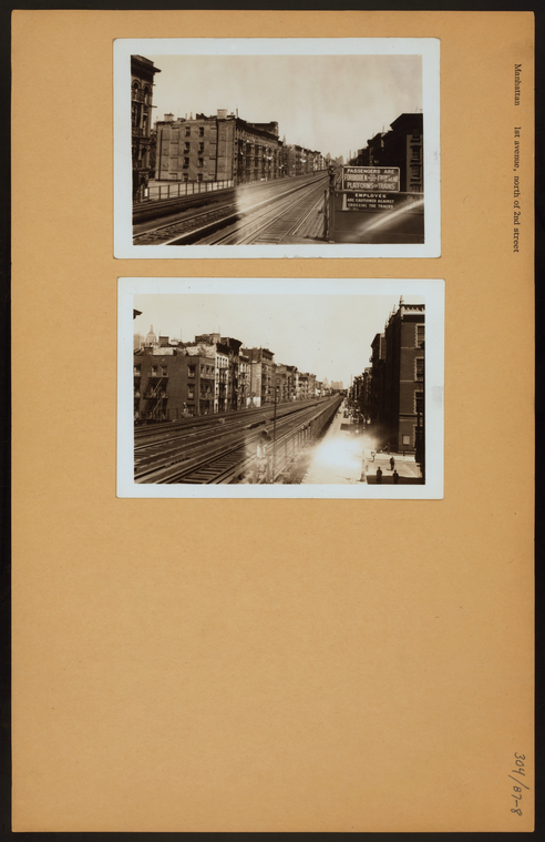
This collection is part of the New York Public Library's substantial array of digital collections that are linked from their website. This particular collection sprang from the NYPL's goal, begun in the 1920s, of collecting photographs that documented soon to be demolished buildings and construction around the city in an effort to preserve the ever-changing face of New York City.
The choice of which objects to digitize seems fairly easy for an institution with as much discretionary digitization spending as the NYPL apparently has. Probably in an effort to provide complete data the NYPL put up the entire collection, which consists of over 36,000 images of photos posted on manila board, many with handwritten notes in the ample margins. Interoperability and access may prove to be a problem because of the collections unique and sometimes frustrating interface.
As far as metadata goes there is a wealth, though some of it is redundant and it lacks reference to key data such as provenance and changes made. Clicking on "image details" will give you the title, the creator (in this case original photographer) and creation date, the collection source, the physical location, and the date the digital object was published. These are good things to know but the data could have dug a little deeper: there are no usage statistics, size or resolution measurements. The objects seem tailor made for linking and use: there are codes to link or embed any object, and in the thumbnail view each object allows "selection", which will make it appear in "my selections", a handy way to organize objects from multiple collections and an even handier way to pay the NYPL money to use them.
As far as characteristics go, the object is zoomable, though only available through an annoying and slow interface. Browsing functionality is fairly robust: objects are not only tagged with relevant subjects, each subject is clickable alone or with others to find more of that subject. In addition, the advanced search function lets you search by any visible metadata field. However, there is a lack of authority or information about object history, which hurts the objects credibility.
My biggest problem with this collection is its annoying interface. One must click through several times to get to an actual image, and even then one must click into a separate screen to zoom with any clarity. In addition, the front page is not very user friendly, consisting of a history of the collection and description of the physical objects but only having a "view all" or "search" link to the actual collection. This collection is arranged by street and intersection, beginning with 1st Avenue and 1st street and continuing up, which could make for a novel google map based interface, but instead the objects are just listed in order, with no way to search for a specific street or intersection. I imagine the intended audience for this collection would be a journalist or serious researcher searching for a specific subject or building, as the frustrating interface and lack of location searching would most likely turn off the casual browser.
No comments:
Post a Comment